


Introduction
Build Pagosa is a 501(c)(3) nonprofit founded in 2017 by local contractors frustrated by a regional skilled-labor shortage.
What began as a woodworking class for 16 students has grown into a six-pathway Career & Technical Education operation serving Pagosa Springs High School — and a $6.5M capital campaign to build a 10,000 sq ft Regional Workforce Center that extends programming to adults and the wider five-county region.
Contents
Brand Strategy
01
Brand Personality
02
Logo
03
Color
04
Graphic Elements
05
Typography
06

01
Brand Strategy
Mission
Our mission is to provide a skilled workforce for the Pagosa Springs community and surrounding area through public-private partnerships, financial support, and workforce training.
Service Area
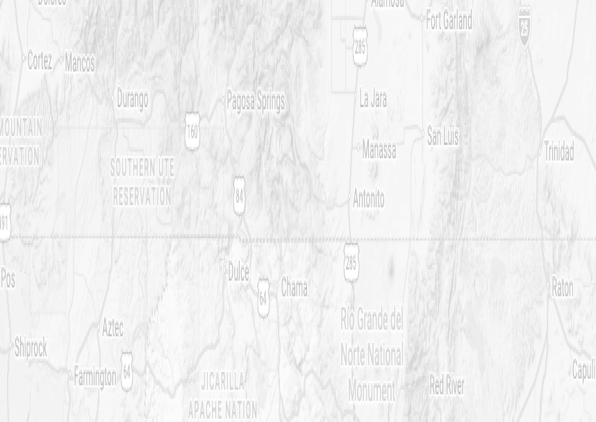
Our reach extends across five counties — Archuleta, Conejos, Hinsdale, and Mineral in Colorado, and Rio Arriba in New Mexico — covering one of the most rural and underserved workforce regions in the Southwest.
History
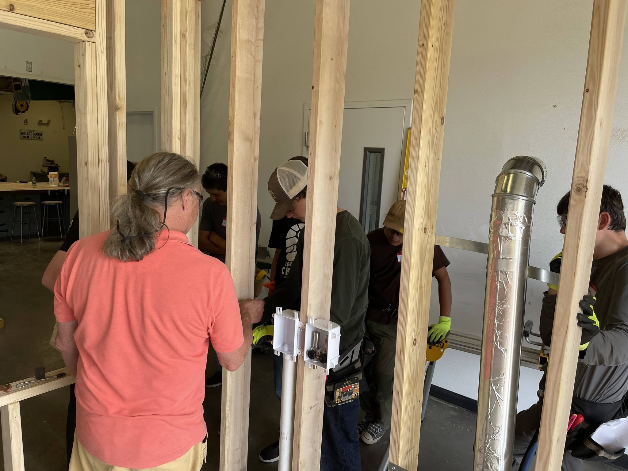
Almost a decade ago, a group of local contractors began meeting to discuss the challenges they faced hiring skilled, local talent. Out of these conversations, Build Pagosa was formed.
Working with the local school district, Build Pagosa helped start a woodworking and construction class which served sixteen students, all with completely donated materials. These classes - which began as a way to keep students engaged - grew to be much more.
Together with the Archuleta School District, Pagosa Springs Community Development Corporation, Pueblo Community College, and industry partners across the region, we connect people to trainings, internships, and hands-on opportunities that people need to build a career here, in Pagosa Springs.

Our Programs
Education Partnerships
We work with the high school to build and strengthen Career & Technical Education pathways - investing in teacher development, facilities, equipment, and supplies across six program areas.
Construction Bootcamp
A week-long intensive training - offered in partnership with Pueblo Community College and Pagosa Springs CDC - that gives participants the hands-on skills and industry connection needed to enter the construction workforce.
Industry Requested Trainings
Working directly with local employers, we offer trainings in credentials they need most - including broadband, CDL, and NCCER certifications - so workers gain qualifications tied to real, available jobs.
Dental School Tuition Assistance
In partnership with Pagosa Peak Dental, we provide tuition support for attendees of the southern Colorado Dental Assisting School - a local pathway into a higher-paying healthcare career without leaving the regon.
Student Internships
We partner with industry employers to reimburse summer internship wages - making it easier for local business to hire students and to gain real-world experience. Employer participation triples when reimbursement is available.
Student Internships
We partner with industry employers to reimburse summer internship wages - making it easier for local business to hire students and to gain real-world experience. Employer participation triples when reimbursement is available.
02
Brand Personality
Our Core Values
Collaboration
Innovation
Integrity
Opportunity
Personality
Our brand personality resembles the often-messy modality of human existence as a series of dynamic tensions that form a multifaceted tapestry. Our messaging has the ability to slide more toward one end of the spectrum or the other in any given area, while always keeping in mind the opposite end.
Community Rooted
Motivating
Honest about challenges
Relaxed
Tone of Voice
We speak like a neighbor

We speak like an expert
We tell stories

We cite data
We're steadied

We're urgent
We celebrate what's possible

We name what's broken
We focus on process

We focus on outcomes
Visual Identity
Organic and hand-crafted

Precise and engineered
Warm

Cool
Unbound

Structured
Textured

Clean
Quiet confidence

Clear authority
Our role in the community
We're a support system

We're a launchpad
We follow the community's lead

We set the direction
We're a local treasure

We're a national model
We're humble about what we've built

We're assertive on what we've built
We're one part of the solution

We are the solution
Our geography is a limitation

Our geography is a strength
The founding story is central

The founding story is context
03
Logo
Logo Lockups
A lockup is the intentional arrangement of a logo and its accompanying elements.
It is a fixed relationship that should not change. In this case, the lockup refers to the pairing of the symbol and name in full color treatment.
Primary
The primary logo (icon + wordmark together) works best where full brand identity and recognition matter most — think business card fronts, signage, apparel, and any first or standalone touchpoint with the brand.

Secondary
If the logo needs to be used alongside busier backgrounds, it can be reduced down to two brand colors.
This increases contrast and simplicity, while still maintaining the overall shape and feel of the logo.


Black and White
Black and white versions used for black and white publications only (i.e. monochromatic ads).


Alternate Marks
A simplified variation of the logo — used when the full primary logo won't fit or fit well. Works best in small or square spaces where detail would get lost, like favicons, app icons, social media profile photos, and watermarks.
Wordmark
Best used where space is tight, horizontal, or minimal: headers, email signatures, letterheads, apparel, and website nav bar.

Outlined Sticker
Best used for stickers and busy backgrounds.

Icons
The icon is the standalone graphic mark of the logo — used independently across applications where simplicity is key, such as profile pictures, favicons, embroidered patches, or anywhere the full lockup isn't practical.
Primary Icon
Works best where the brand is already well known or space is too small for text, like app icons, favicons, social media avatars, and pattern or texture elements.

Single-Color Icon
Works best on colored or busy backgrounds, in print with limited color options, on signage like embossing or engraving, and in watermarks where a flat, monochrome mark reads more cleanly.

Favicon
A favicon is the small icon (usually 16×16 or 32×32 pixels) that appears next to a website's title in a browser tab, bookmark list, or history entry. It's typically a simplified version of a brand's logo, used to help users quickly recognize a site among multiple open tabs.
Primary
Works best as a favicon when being displayed particularly small, like website favicons, or social media profiles.

Alternate
Works best when slightly more space is available and the wordmark remains legible, like larger social media avatars, or where the audience benefits from reading the name directly.
Clear Space
Logo clear space is the minimum area around a logo that keeps it legible and prominent.
Consistently applying this space across all materials preserves brand recognition.
A quick way to ensure enough clear space is to copy the icon and paste it around the edges of the logo.

Best Practices
- Do ensure there is adequate space around the logo from other extraneous elements.
- Do not resize or change the position of any individual element.
- Do not use any other font, no matter how close it resembles the font in our logo.
- Do not distort the logo. Any re-sizing must be done in proportion.
- Do not change the colors, even if they look similar. Use the official color specifications detailed in these guidelines.
- Do not use a drop shadow or outer glow on the logo. Use discretion on the appropriate colored logo to contrast with busy or colored backgrounds.


04
Color
Color Overview
The Build Pagosa color palette is derived directly from photography of the Pagosa region. It works to create a distinct visual language that is grounded in natural, earthy tones.
Primary Palette
A primary color palette is the foundation of a brand's visual identity — the core set of colors used most consistently across all touchpoints, including logos, signage, and key design elements. Establishes immediate recognition and sets the overall tone of the brand.
Bootcamp Brown
Hex: #5E4C43
Oxide
Hex: #BD6239
Chimney Rock
Hex: #D78F2D
Weminuche Green
Hex: #666643
Secondary Palette
The secondary color palette complements and supports the primary colors, providing flexibility and visual depth across a wider range of applications. These colors are used to add variety, create contrast, and enhance the overall design system without overpowering the brand's core identity.
Shop Floor Gray
Hex: #E0DBD1
Sawdust
Hex: #F4EED8
Steel
Hex: #CDD3D3
Sugarloaf
Hex: #FAF9F5
Type Colors
The following arrangements help distinguish the most legible typography color pairings.
Only Sugarloaf text on Oxide
Only Sugarloaf text on Chimney Rock
Only Sugarloaf text on Weminuche Green
Only Bootcamp Brown text on Shop Floor Gray
Only Bootcamp Brown text on Sawdust
Only Bootcamp Brown text on Steel
Only Bootcamp Brown text on Sugarloaf
Only Sugarloaf text on Bootcamp Brown
Color Parings
These color combinations are proven to work well together, providing enough of a value contrast to accent each other.
Color Pairings to Avoid
These color combinations do not work well together or connote other brand colors that we aim to avoid (i.e. orange and blue as Broncos colors).
Recommended Use Cases
Understanding how brand colors are used — and which combinations are most legible — ensures that every touchpoint is not only visually consistent but accessible and easy to read across all formats and audiences.
Bootcamp Brown
Recommended for:
- Logo
- Text color (primary)
- Web: Background color, buttons, hover effects
Not recommended for:
- Reports or text-heavy docs: Full-page background (use only in select boxes)
Oxide
Recommended for:
- Smaller visual accents
- Logo
- Web: Small sections of color
- Social Media: Background color for posts
Not recommended for:
- Text color
- Reports or text-heavy docs: Full-page background (use only in select boxes)
Chimney Rock
Recommended for:
- Smaller visual accents
- Web: Small sections of color
- Social Media: Background color for posts
Not recommended for:
- Logo
- Text color
- Reports or text-heavy docs: Full-page background (use only in select boxes)
Weminuche Green
Recommended for:
- Web: Background color, buttons, hover effects
- Social Media: Background color for posts
Not recommended for:
- Logo
- Text color
- Reports or text-heavy docs: Full-page background (use only in select boxes)
Shop Floor Gray
Recommended for:
- Web: Background color, buttons, hover effects
- Social Media: Background color for posts
- Reports or text-heavy docs: Full-page background
Not recommended for:
- Logo
- Text color
- Reports or text-heavy docs: Full-page background (use only in select boxes)
Sawdust
Recommended for:
- Text color (on darker backgrounds)
- Web: Background color, buttons, hover effects
- Social Media: Background color for posts
- Reports or text-heavy docs: Full-page background
Not recommended for:
- Logo
- Smaller visual accents
Steel
Recommended for:
- Web: Background color, buttons, hover effects
- Social Media: Background color for posts
- Reports or text-heavy docs: Full-page background
Not recommended for:
- Logo
- Text color
- Reports or text-heavy docs: Full-page background (use only in select boxes)
Sugarloaf
Recommended for:
- Logo
- Text color (on darker backgrounds)
- Web: Background color, buttons, hover effects
- Reports or text-heavy docs: Full-page background
Not recommended for:
- Smaller visual accents
05
Graphic Elements
Image Textures
We utilize textured image backgrounds in Adobe Photoshop, Figma and Canva to bring depth and a handcrafted quality to the brand.
Earthy and woody textures are specifically used to bring a connection to the natural world and the Colorado region, as well as referencing the materials used in the construction courses.
It is important to always use high-resolution textures. We frequently refer to Unsplash.com or Pixabay.com to get free-to-low-cost textures.




Textured Shapes
We’ve created a suite of textured shapes that feature rough edges inspired by real, hand crafted woodwork. The shapes should be used as accents, like as background elements, line breaks, or image cutouts.
Its important not to resize or modify these shape graphics as to avoid stretching or amplifying the texture.

Symbols
We use symbols to add visual flair across the brand and to allow users to quickly categorize information based on pictorial marks. They work best when supporting text or as small accents.
Our icon set is tailored for Build Pagosa, extending the rough wood cut look found in the logo and textured shapes. Because of this, no other icons should be used.


Program and CTE Symbols
It’s important to ensure that symbols are kept consistent so that people can quickly and easily identify what each symbol represents
Education partnerships:
Backpack

Construction bootcamp:
Hard Hat

Industry requested trainings:
Clipboard

Dental school tuition assistance:
Tooth

Student internships:
Student

Hospitality & culinary
Chef

Building trades
Wrench

Agriculture & resources
Tractor

Computer science
Code

Transportation & automotive
Car

Health services
Heart

Social Media Templates for each Audience
- Youth and Young Adults (under 18)
We use short, fast-paced video content led by students and interns themselves.
Recommended channels: Instagram, TikTok, YouTube
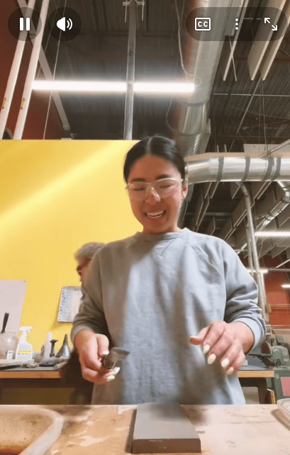
REAL TESTIMONIALS FROM STUDENTS
We hand the camera to our interns and students to hear about direct impact. No scripts, just authentic relating.
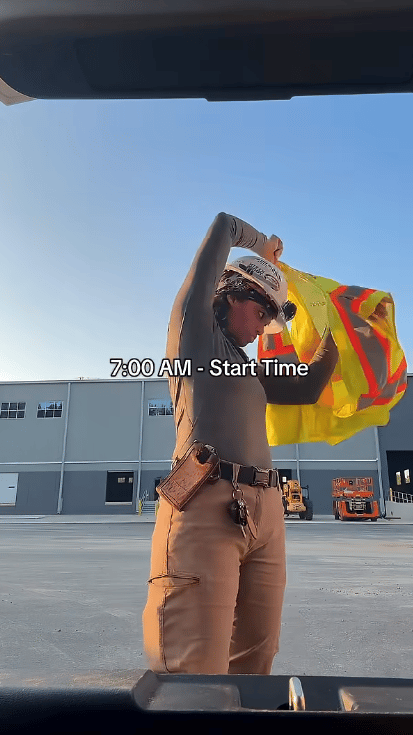
“DAY-IN-THE-LIFE” CLIPS
Students show clips from the shop floor, the job sites, and the classroom.

15
DAYS
Until Submissions are Due
INFORMATIONAL / COUNTDOWNS
We help students understand upcoming important dates, must-do’s for their applications, and helpful tips for getting the most of their certification.
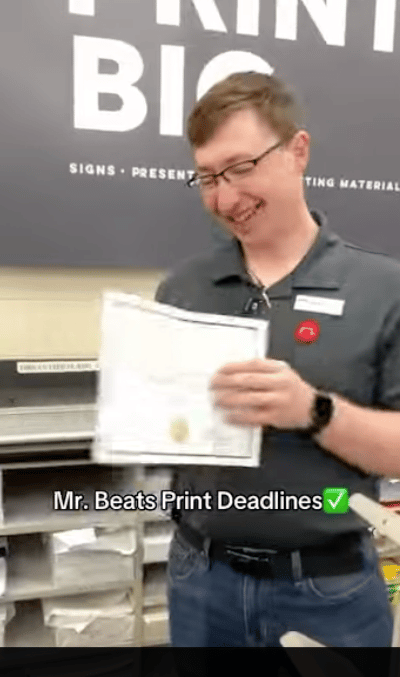
Jim just got his NCCER certificate. Here’s what happens next.
MILESTONE CELEBRATIONS
Students share about their accomplishments. I.e. their first solo build, their first paycheck, first certification.
- Adults in the CTE programs (over 18)
We lead with placement data, program timelines, and clear calls to action. Can be static or video (with preference to video)
Recommended channels: Instagram, YouTube, Facebook, LinkedIn, advertisements.
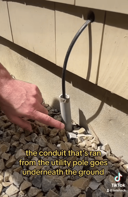
ADULTS IN CURRENT PROGRAMS
Here’s where we go in the classrooms and on the job sites, and showcase what adults are learning. We are documenting their journey.

ALUMNI NETWORKING
We post short testimonial videos from recent graduates who have new credentials and are ready for/participating in the workforce.
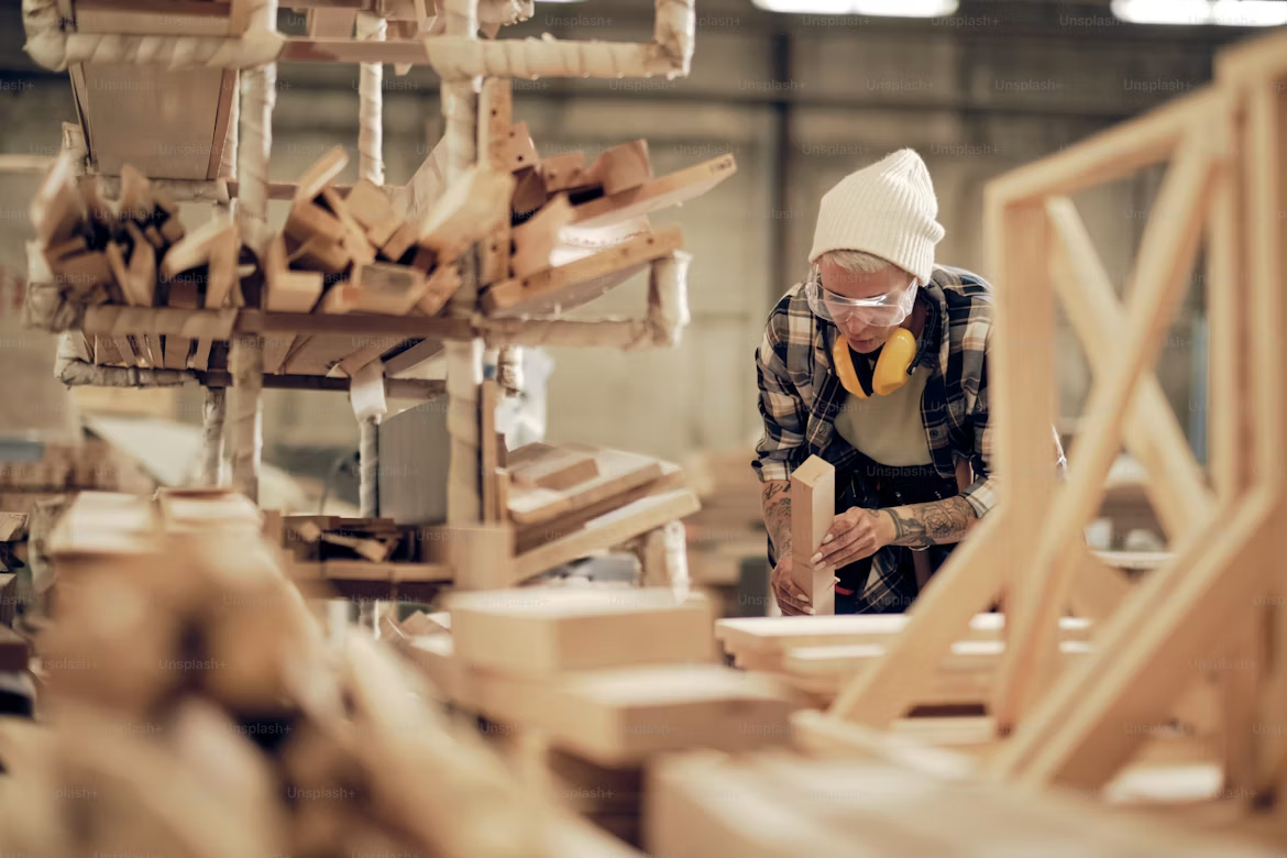
250+
JOBS
go unfilled in our region every year. Not because the work isn't there, but because the training infrastructure isn't.
DIRECT IMPACT NUMBERS
We share our numbers plainly: placement rates, time-to-credential, earning potential. We incentivize adult enrollment.
10
DAYS
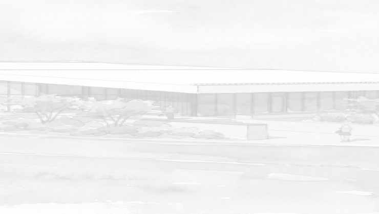
Until our Regional Workforce Development Center opens!
INFORMATIONAL / COUNTDOWNS
We help adults understand upcoming important dates, must-do’s for their applications, and helpful tips for getting the most of their certification.
- Training Professionals, Trade Employers & Contractors
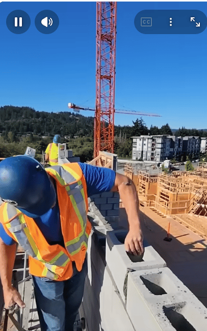
Professional channels communicate curriculum quality and graduate readiness.
Recommended channels: Facebook, LinkedIn, job posting boards, advertisements.

We’re seeking training professionals for our
CDL Program
ROLES AVAILABLE
We post curriculum updates, certifications offered, and graduate competencies.
REAL TESTIMONIALS
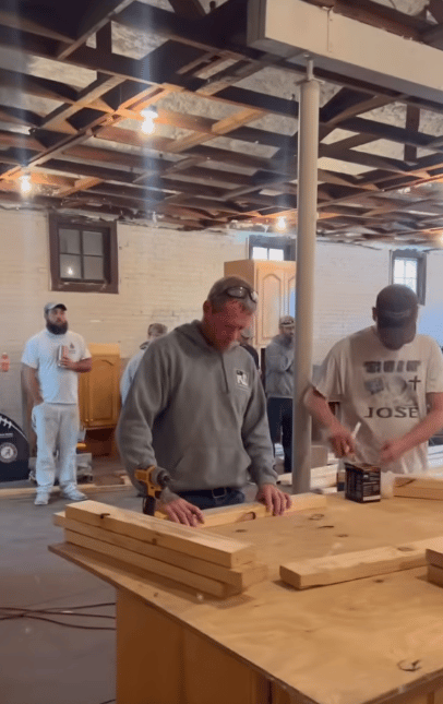
We publish short employer testimonial videos explaining why they hire our graduates.

Win-win:
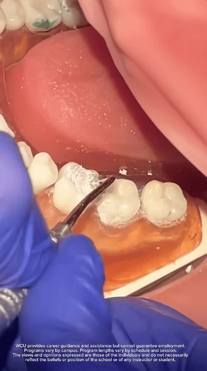
A training program for them. A new group of skilled workers for your business.
LABOR MATCHMAKING
We include workforce data and labor market context to ensure training professionals understand the value they’ll get out of leading at Build Pagosa.

Thank you to Pagosa Peak Dental for supporting the Fall 2026 cohort!
CHARITABLE LANGUAGE
Training professionals are giving back. We actively show recognition and gratitude for the time they give to the community.
Photography: Special Styles
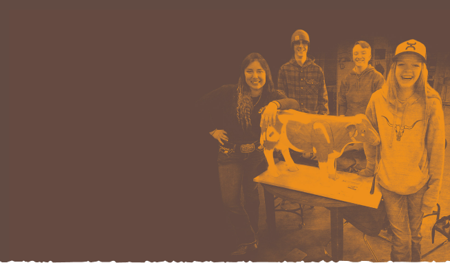
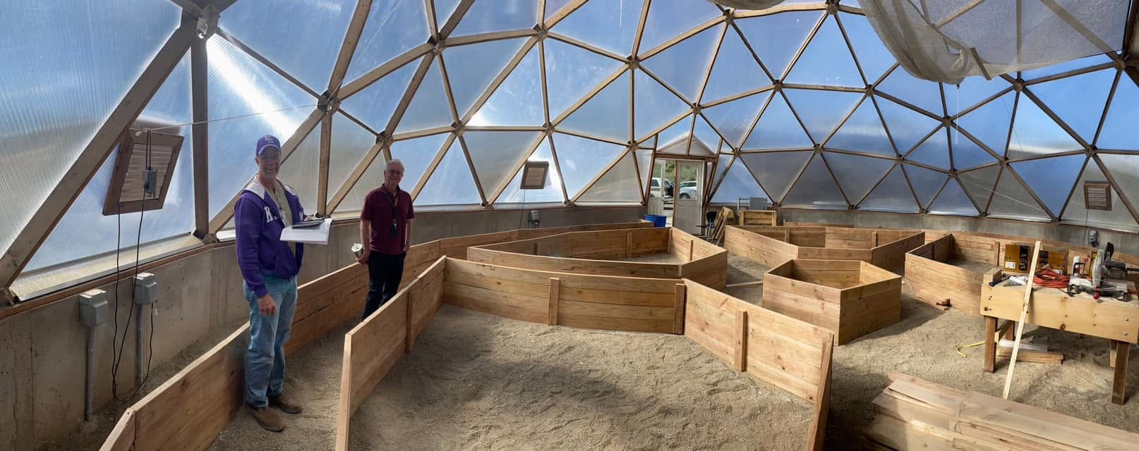
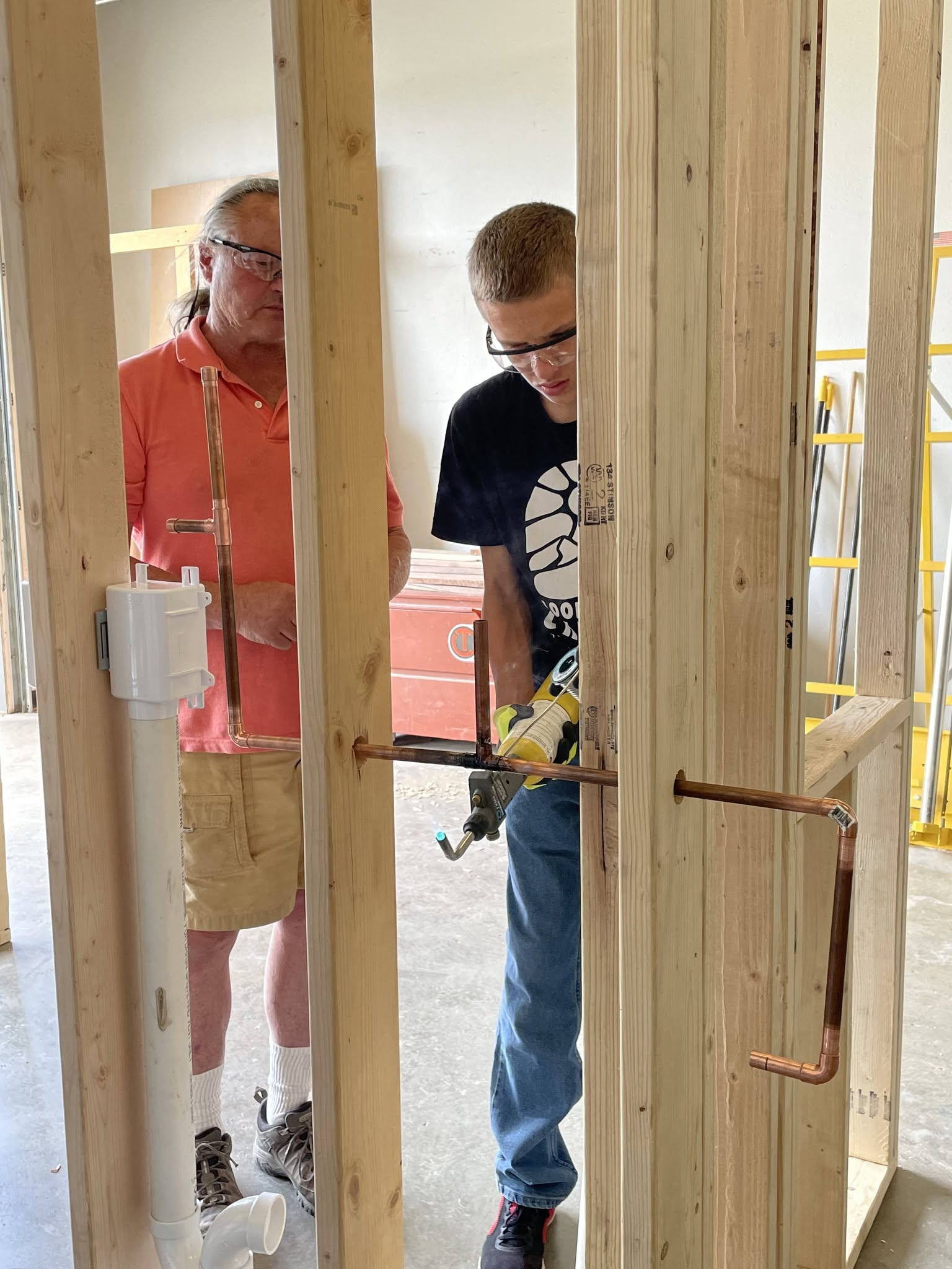
Our website homepage hero images feature a branded duotone, jagged edges reflective of our logo, and earthy texture overlays. We create a consistent, professional first impression across each page of the website.
This stylistic treatment is reserved for the website and formal materials. This helps establish brand recognition in a controlled, polished environment. Users of the website are more likely to trust branded, professional photography.
Social media operates differently. Platforms like Instagram, Facebook, and TikTok reward authentic, natural content without filters. Viewers on social media will trust in-the-moment photography.


Photography: Social Media
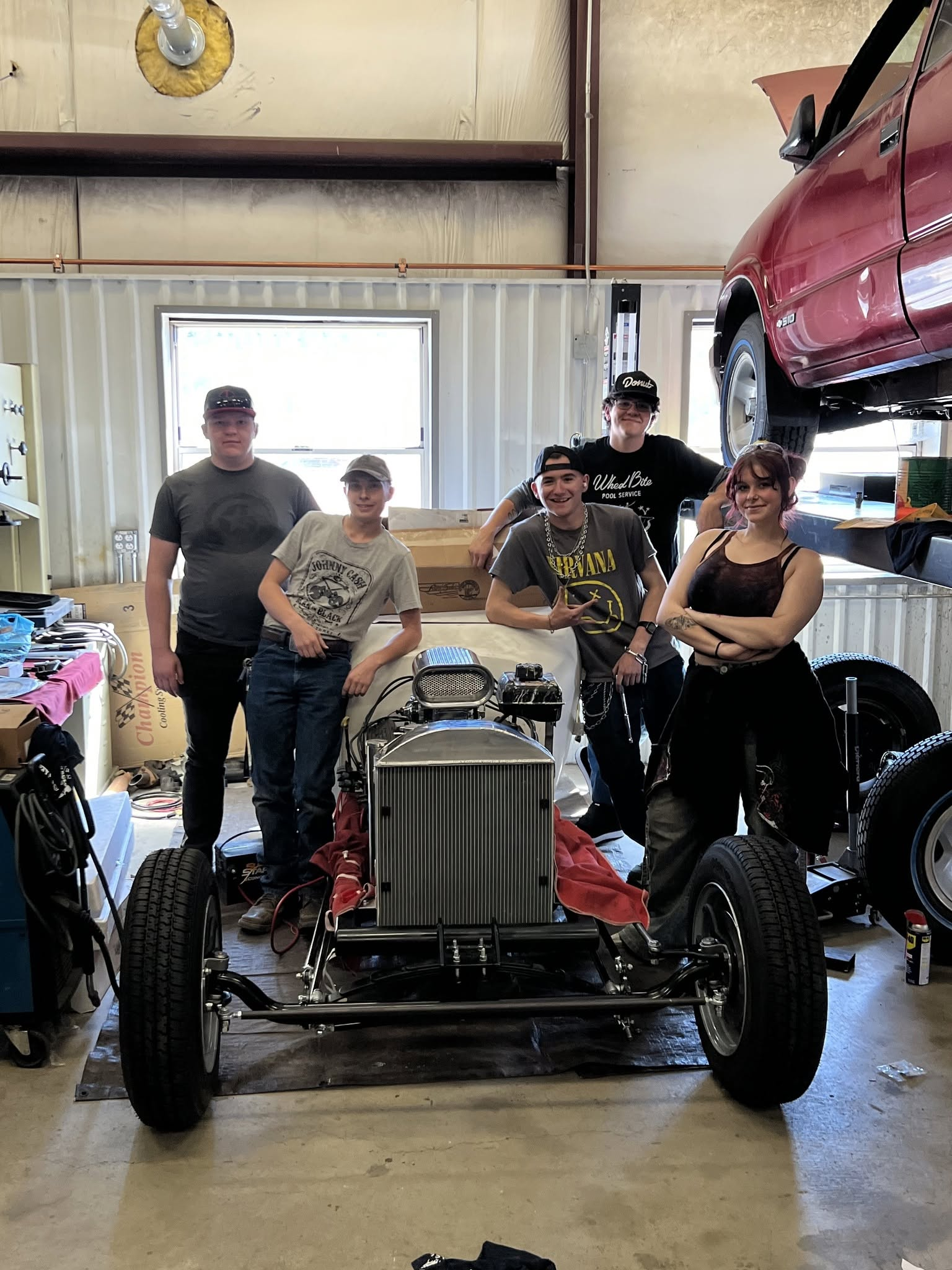
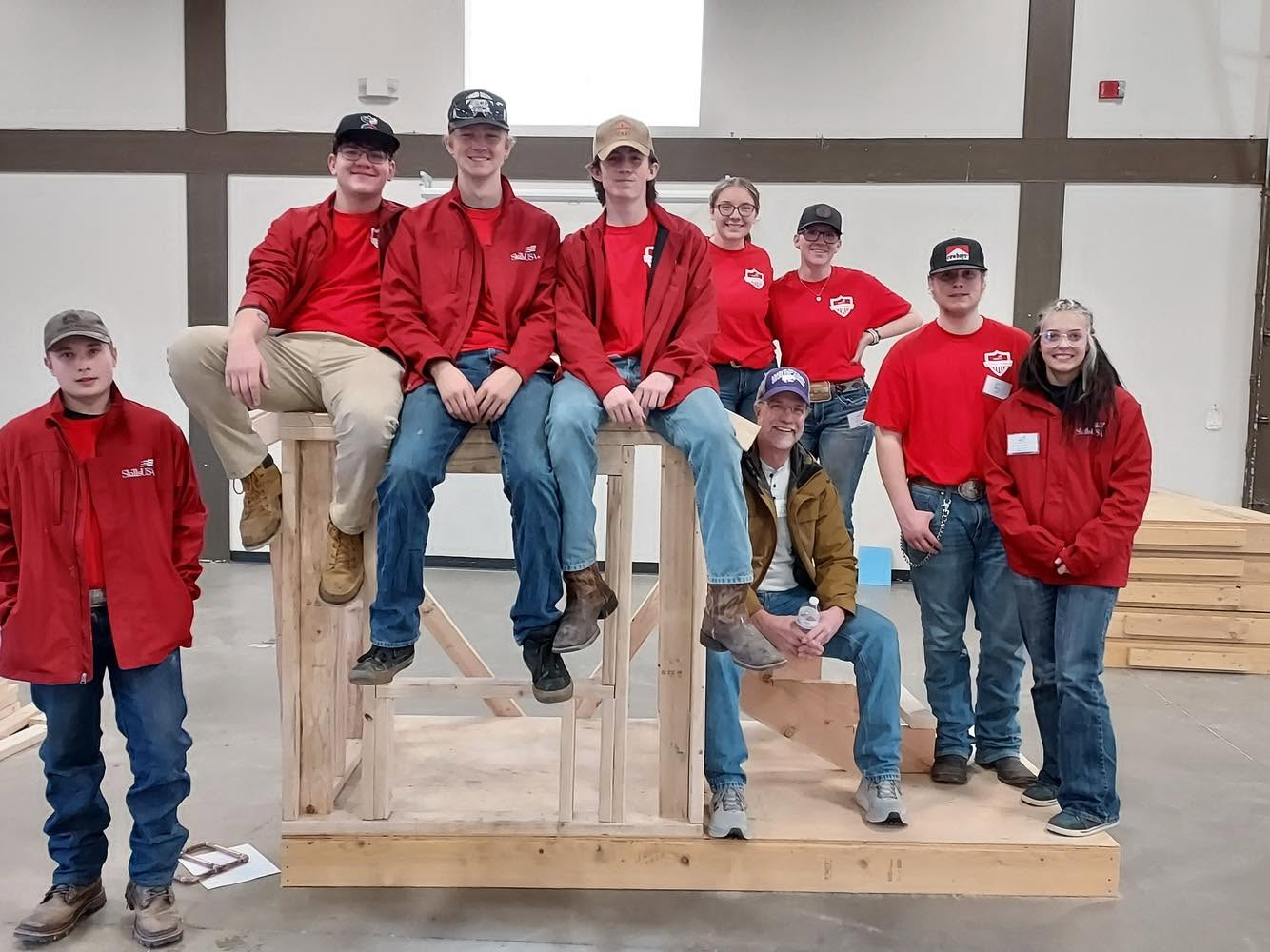
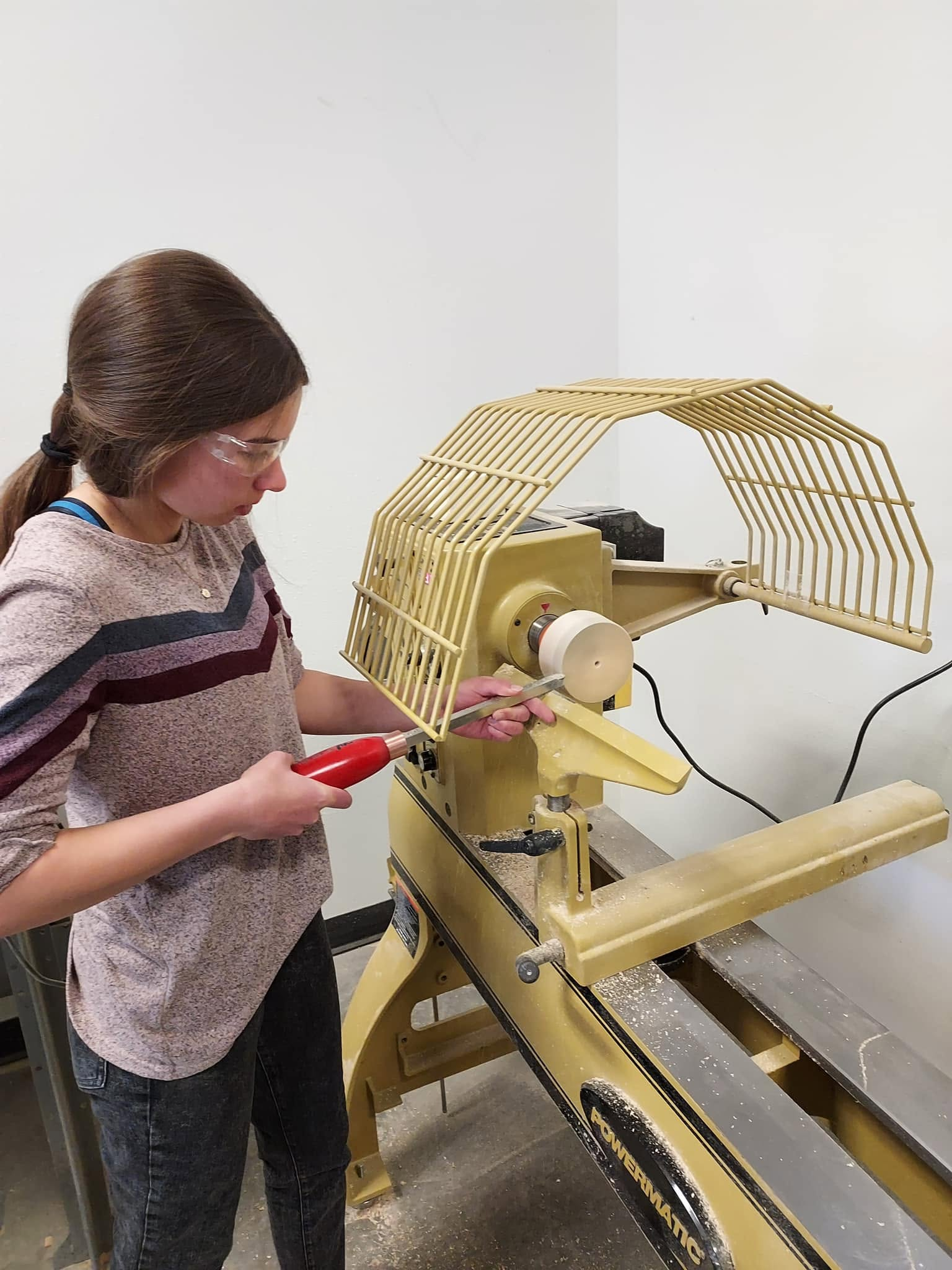
Social media followers recognize the people first. We showcase the locals in our programs, the relationships that are formed, and the facilities that open the door to possibility.
Build Pagosa’s photography on social media features:
- Students in process of building
- Cohorts posing together
- The amicable relationship between training leaders and their students
- “Finished products” that students have built, whether as small as a woodworking item or as large as a facility
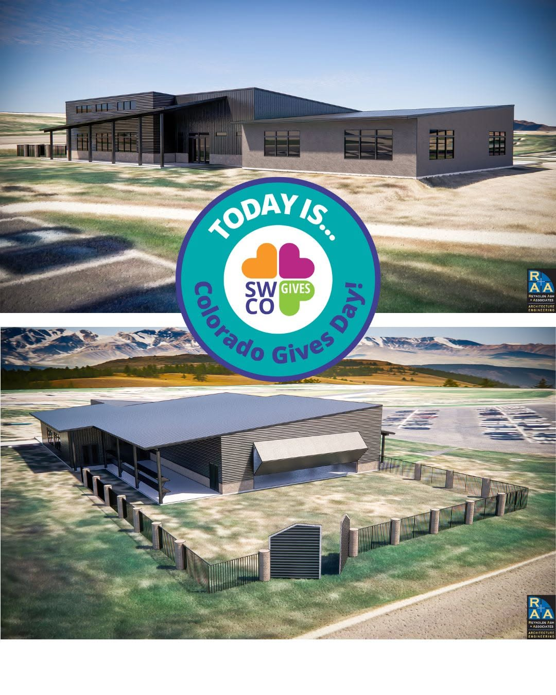
Social media should also feature new photos of the Regional Workforce Development Center. We are building buzz and anticipation. When the building is complete, we can celebrate how each room is used. Followers will get a real sense of what it’s like on the inside, and feel welcome to come see it for themselves.
For the best engagement, we keep text on images light and let the photos speak for themselves. Our grid works best as a scrapbook of the wonderful things we do, full of genuine moments and real stories, rather than a catalogue of advertisements. We save the details, context, and calls to action for the caption of the photos.
How to do color duotones
Instructions for duotones on Canva:
- Upload your photo – Click "Uploads" in the left sidebar and add your image, then drag it onto your canvas.
- Select the image – Click on the photo once to select it.
- Open the Edit Photo panel – Click "Edit Photo" in the top toolbar.
- Find Duotone – Scroll down to the "Effects" section and click "Duotone."
- Pick a preset – Choose any starting duotone preset (you'll customize the colors next).
- Customize the colors – Click on the two color swatches shown and enter your brand's exact hex codes — one for shadows (darker tone) and one for highlights (lighter tone).
- Adjust intensity – Use the slider (if available) to fine-tune how strong the effect looks.
- Apply and review – Click outside the panel to apply, then check contrast and readability if you're adding text over the image.
- Download or reuse – Export the image, or save it as a brand asset so you can apply the same duotone look consistently across future designs.
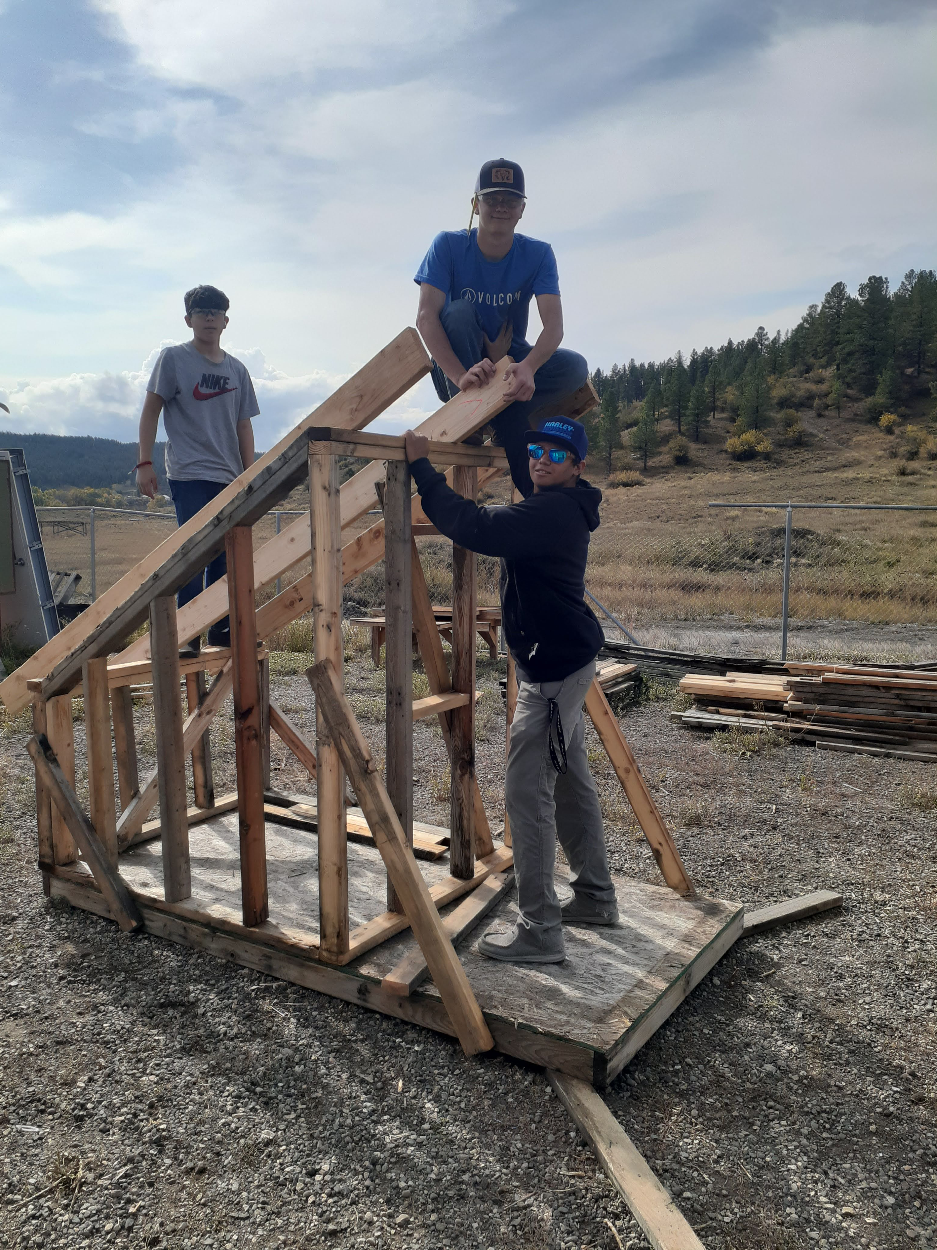
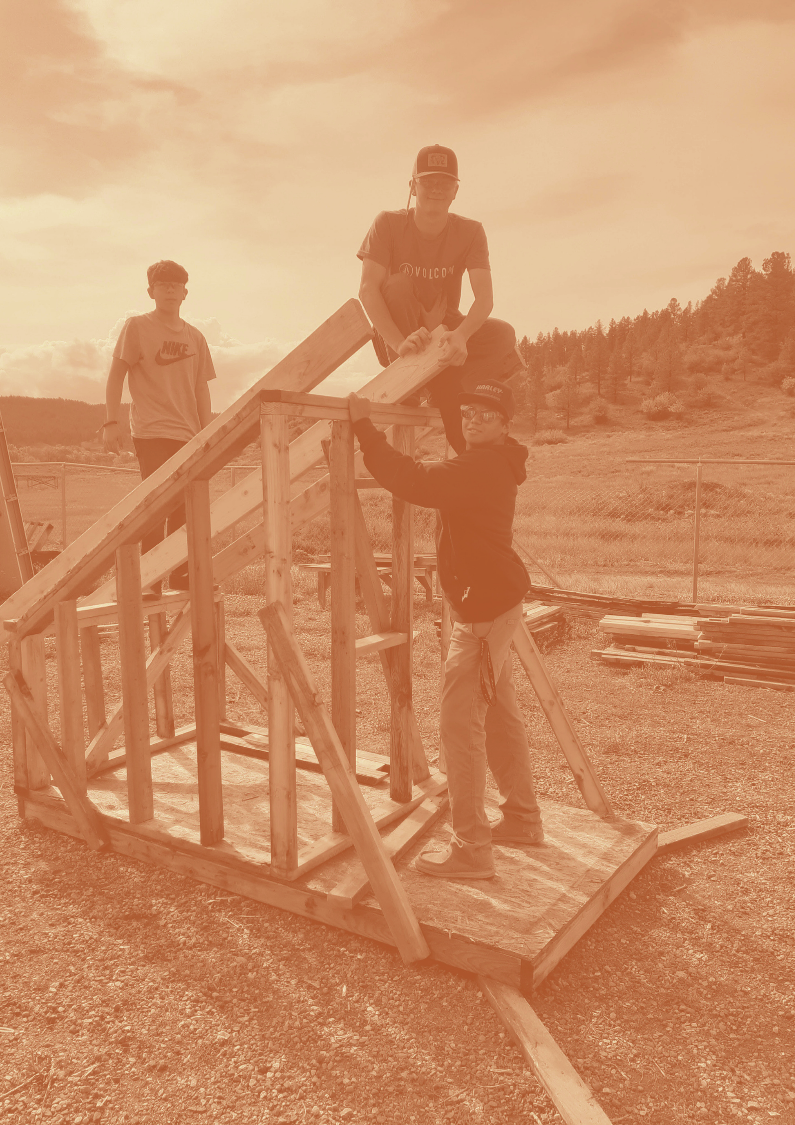
Duotone coloring helps:
- Simplify busy photography
- Accentuate low-resolution cell phone photos (where high-resolution photos are not possible)
- Make posters and display images feel more polished and intentional
- Create a darker or lighter value for text/the logo to appear more clearly on
06
Typography
Headings
Manrope is available on Google Fonts for free.
Headings establish visual hierarchy and guide readers through content, signaling what is most important and helping audiences quickly navigate pages, documents, and materials.
H1
Manrope Extrabold
Size: 32pt
110% Leading
0% Tracking
H2
Manrope Bold
Size: 24pt
110% Leading
0% Tracking
H3
Manrope Semibold
Size: 18pt
110% Leading
0% Tracking
H4
Manrope Semibold
Size: 14pt
120% Leading
0% Tracking
Body
Body text is the primary vehicle for communicating a foundation's message, making legibility essential — a well-chosen body font ensures that content is easy to read across all formats, sizes, and audiences.
Body - small can be used for captions, subsection labels, and secondary details.
Body - Primary
Manrope Regular
Size: 10pt
120% Leading
1% Tracking
Body - Small
Manrope Regular
Size:7pt
120% Leading
1% Tracking
About Us
Almost a decade ago, a group of local contractors began meeting to discuss the challenges they faced hiring skilled, local talent.
Out of these conversations, Build Pagosa was formed.
Mission
Build Pagosa’s Mission is to provide a skilled workforce for the Pagosa Springs community and surrounding area through public-private partnerships, financial support and workforce training.
Photos courtesy of Photographer 1.


Introduction
Build Pagosa is a 501(c)(3) nonprofit founded in 2017 by local contractors frustrated by a regional skilled-labor shortage.
What began as a woodworking class for 16 students has grown into a six-pathway Career & Technical Education operation serving Pagosa Springs High School — and a $6.5M capital campaign to build a 10,000 sq ft Regional Workforce Center that extends programming to adults and the wider five-county region.
Contents
Brand Strategy
01
Brand Personality
02
Logo
03
Color
04
Graphic Elements
05
Typography
06

01
Brand Strategy
Mission
Our mission is to provide a skilled workforce for the Pagosa Springs community and surrounding area through public-private partnerships, financial support, and workforce training.
Service Area
Our reach extends across five counties — Archuleta, Conejos, Hinsdale, and Mineral in Colorado, and Rio Arriba in New Mexico — covering one of the most rural and underserved workforce regions in the Southwest.
History
Almost a decade ago, a group of local contractors began meeting to discuss the challenges they faced hiring skilled, local talent. Out of these conversations, Build Pagosa was formed.
Working with the local school district, Build Pagosa helped start a woodworking and construction class which served sixteen students, all with completely donated materials. These classes - which began as a way to keep students engaged - grew to be much more.
Together with the Archuleta School District, Pagosa Springs Community Development Corporation, Pueblo Community College, and industry partners across the region, we connect people to trainings, internships, and hands-on opportunities that people need to build a career here, in Pagosa Springs.
Our Programs
Education Partnerships
We work with the high school to build and strengthen Career & Technical Education pathways - investing in teacher development, facilities, equipment, and supplies across six program areas.
Construction Bootcamp
A week-long intensive training - offered in partnership with Pueblo Community College and Pagosa Springs CDC - that gives participants the hands-on skills and industry connection needed to enter the construction workforce.
Industry Requested Trainings
Working directly with local employers, we offer trainings in credentials they need most - including broadband, CDL, and NCCER certifications - so workers gain qualifications tied to real, available jobs.
Dental School Tuition Assistance
In partnership with Pagosa Peak Dental, we provide tuition support for attendees of the southern Colorado Dental Assisting School - a local pathway into a higher-paying healthcare career without leaving the regon.
Student Internships
We partner with industry employers to reimburse summer internship wages - making it easier for local business to hire students and to gain real-world experience. Employer participation triples when reimbursement is available.
Student Internships
We partner with industry employers to reimburse summer internship wages - making it easier for local business to hire students and to gain real-world experience. Employer participation triples when reimbursement is available.
02
Brand Personality
Our Core Values
Collaboration
Innovation
Integrity
Opportunity
Personality
Our brand personality resembles the often-messy modality of human existence as a series of dynamic tensions that form a multifaceted tapestry. Our messaging has the ability to slide more toward one end of the spectrum or the other in any given area, while always keeping in mind the opposite end.
Community Rooted
Motivating
Honest about challenges
Relaxed
Tone of Voice
We speak like a neighbor

We speak like an expert
We tell stories

We cite data
We're steadied

We're urgent
We celebrate what's possible

We name what's broken
We focus on process

We focus on outcomes
Visual Identity
Organic and hand-crafted

Precise and engineered
Warm

Cool
Unbound

Structured
Textured

Clean
Quiet confidence

Clear authority
Our role in the community
We're a support system

We're a launchpad
We follow the community's lead

We set the direction
We're a local treasure

We're a national model
We're humble about what we've built

We're assertive on what we've built
We're one part of the solution

We are the solution
Our geography is a limitation

Our geography is a strength
The founding story is central

The founding story is context
03
Logo
Logo Lockups
A lockup is the intentional arrangement of a logo and its accompanying elements.
It is a fixed relationship that should not change. In this case, the lockup refers to the pairing of the symbol and name in full color treatment.
Primary
The primary logo (icon + wordmark together) works best where full brand identity and recognition matter most — think business card fronts, signage, apparel, and any first or standalone touchpoint with the brand.

Secondary
If the logo needs to be used alongside busier backgrounds, it can be reduced down to two brand colors.
This increases contrast and simplicity, while still maintaining the overall shape and feel of the logo.


Black and White
Black and white versions used for black and white publications only (i.e. monochromatic ads).


Alternate Marks
A simplified variation of the logo — used when the full primary logo won't fit or fit well. Works best in small or square spaces where detail would get lost, like favicons, app icons, social media profile photos, and watermarks.
Wordmark
Best used where space is tight, horizontal, or minimal: headers, email signatures, letterheads, apparel, and website nav bar.

Outlined Sticker
Best used for stickers and busy backgrounds.

Icons
The icon is the standalone graphic mark of the logo — used independently across applications where simplicity is key, such as profile pictures, favicons, embroidered patches, or anywhere the full lockup isn't practical.
Primary Icon
Works best where the brand is already well known or space is too small for text, like app icons, favicons, social media avatars, and pattern or texture elements.

Single-Color Icon
Works best on colored or busy backgrounds, in print with limited color options, on signage like embossing or engraving, and in watermarks where a flat, monochrome mark reads more cleanly.

Favicon
A favicon is the small icon (usually 16×16 or 32×32 pixels) that appears next to a website's title in a browser tab, bookmark list, or history entry. It's typically a simplified version of a brand's logo, used to help users quickly recognize a site among multiple open tabs.
Primary
Works best as a favicon when being displayed particularly small, like website favicons, or social media profiles.

Alternate
Works best when slightly more space is available and the wordmark remains legible, like larger social media avatars, or where the audience benefits from reading the name directly.
Clear Space
Logo clear space is the minimum area around a logo that keeps it legible and prominent.
Consistently applying this space across all materials preserves brand recognition.
A quick way to ensure enough clear space is to copy the icon and paste it around the edges of the logo.

Best Practices
- Do ensure there is adequate space around the logo from other extraneous elements.
- Do not resize or change the position of any individual element.
- Do not use any other font, no matter how close it resembles the font in our logo.
- Do not distort the logo. Any re-sizing must be done in proportion.
- Do not change the colors, even if they look similar. Use the official color specifications detailed in these guidelines.
- Do not use a drop shadow or outer glow on the logo. Use discretion on the appropriate colored logo to contrast with busy or colored backgrounds.


04
Color
Color Overview
The Build Pagosa color palette is derived directly from photography of the Pagosa region. It works to create a distinct visual language that is grounded in natural, earthy tones.
Primary Palette
A primary color palette is the foundation of a brand's visual identity — the core set of colors used most consistently across all touchpoints, including logos, signage, and key design elements. Establishes immediate recognition and sets the overall tone of the brand.
Bootcamp Brown
Hex: #5E4C43
Oxide
Hex: #BD6239
Chimney Rock
Hex: #D78F2D
Weminuche Green
Hex: #666643
Secondary Palette
The secondary color palette complements and supports the primary colors, providing flexibility and visual depth across a wider range of applications. These colors are used to add variety, create contrast, and enhance the overall design system without overpowering the brand's core identity.
Shop Floor Gray
Hex: #E0DBD1
Sawdust
Hex: #F4EED8
Steel
Hex: #CDD3D3
Sugarloaf
Hex: #FAF9F5
Type Colors
The following arrangements help distinguish the most legible typography color pairings.
Only Sugarloaf text on Oxide
Only Sugarloaf text on Chimney Rock
Only Sugarloaf text on Weminuche Green
Only Bootcamp Brown text on Shop Floor Gray
Only Bootcamp Brown text on Sawdust
Only Bootcamp Brown text on Steel
Only Bootcamp Brown text on Sugarloaf
Only Sugarloaf text on Bootcamp Brown
Color Parings
These color combinations are proven to work well together, providing enough of a value contrast to accent each other.
Color Pairings to Avoid
These color combinations do not work well together or connote other brand colors that we aim to avoid (i.e. orange and blue as Broncos colors).
Recommended Use Cases
Understanding how brand colors are used — and which combinations are most legible — ensures that every touchpoint is not only visually consistent but accessible and easy to read across all formats and audiences.
Bootcamp Brown
Recommended for:
- Logo
- Text color (primary)
- Web: Background color, buttons, hover effects
Not recommended for:
- Reports or text-heavy docs: Full-page background (use only in select boxes)
Oxide
Recommended for:
- Smaller visual accents
- Logo
- Web: Small sections of color
- Social Media: Background color for posts
Not recommended for:
- Text color
- Reports or text-heavy docs: Full-page background (use only in select boxes)
Chimney Rock
Recommended for:
- Smaller visual accents
- Web: Small sections of color
- Social Media: Background color for posts
Not recommended for:
- Logo
- Text color
- Reports or text-heavy docs: Full-page background (use only in select boxes)
Weminuche Green
Recommended for:
- Web: Background color, buttons, hover effects
- Social Media: Background color for posts
Not recommended for:
- Logo
- Text color
- Reports or text-heavy docs: Full-page background (use only in select boxes)
Shop Floor Gray
Recommended for:
- Web: Background color, buttons, hover effects
- Social Media: Background color for posts
- Reports or text-heavy docs: Full-page background
Not recommended for:
- Logo
- Text color
- Reports or text-heavy docs: Full-page background (use only in select boxes)
Sawdust
Recommended for:
- Text color (on darker backgrounds)
- Web: Background color, buttons, hover effects
- Social Media: Background color for posts
- Reports or text-heavy docs: Full-page background
Not recommended for:
- Logo
- Smaller visual accents
Steel
Recommended for:
- Web: Background color, buttons, hover effects
- Social Media: Background color for posts
- Reports or text-heavy docs: Full-page background
Not recommended for:
- Logo
- Text color
- Reports or text-heavy docs: Full-page background (use only in select boxes)
Sugarloaf
Recommended for:
- Logo
- Text color (on darker backgrounds)
- Web: Background color, buttons, hover effects
- Reports or text-heavy docs: Full-page background
Not recommended for:
- Smaller visual accents
05
Graphic Elements
Image Textures
We utilize textured image backgrounds in Adobe Photoshop, Figma and Canva to bring depth and a handcrafted quality to the brand.
Earthy and woody textures are specifically used to bring a connection to the natural world and the Colorado region, as well as referencing the materials used in the construction courses.
It is important to always use high-resolution textures. We frequently refer to Unsplash.com or Pixabay.com to get free-to-low-cost textures.
Textured Shapes
We’ve created a suite of textured shapes that feature rough edges inspired by real, hand crafted woodwork. The shapes should be used as accents, like as background elements, line breaks, or image cutouts.
Its important not to resize or modify these shape graphics as to avoid stretching or amplifying the texture.

Symbols
We use symbols to add visual flair across the brand and to allow users to quickly categorize information based on pictorial marks. They work best when supporting text or as small accents.
Our icon set is tailored for Build Pagosa, extending the rough wood cut look found in the logo and textured shapes. Because of this, no other icons should be used.


Program and CTE Symbols
It’s important to ensure that symbols are kept consistent so that people can quickly and easily identify what each symbol represents
Education partnerships:
Backpack

Construction bootcamp:
Hard Hat

Industry requested trainings:
Clipboard

Dental school tuition assistance:
Tooth

Student internships:
Student

Hospitality & culinary
Chef

Building trades
Wrench

Agriculture & resources
Tractor

Computer science
Code

Transportation & automotive
Car

Health services
Heart

Social Media Templates for each Audience
- Youth and Young Adults (under 18)
We use short, fast-paced video content led by students and interns themselves.
Recommended channels: Instagram, TikTok, YouTube
REAL TESTIMONIALS FROM STUDENTS
We hand the camera to our interns and students to hear about direct impact. No scripts, just authentic relating.
“DAY-IN-THE-LIFE” CLIPS
Students show clips from the shop floor, the job sites, and the classroom.
15
DAYS
Until Submissions are Due
INFORMATIONAL / COUNTDOWNS
We help students understand upcoming important dates, must-do’s for their applications, and helpful tips for getting the most of their certification.
Jim just got his NCCER certificate. Here’s what happens next.
MILESTONE CELEBRATIONS
Students share about their accomplishments. I.e. their first solo build, their first paycheck, first certification.
- Adults in the CTE programs (over 18)
We lead with placement data, program timelines, and clear calls to action. Can be static or video (with preference to video)
Recommended channels: Instagram, YouTube, Facebook, LinkedIn, advertisements.
ADULTS IN CURRENT PROGRAMS
Here’s where we go in the classrooms and on the job sites, and showcase what adults are learning. We are documenting their journey.
ALUMNI NETWORKING
We post short testimonial videos from recent graduates who have new credentials and are ready for/participating in the workforce.
250+
JOBS
go unfilled in our region every year. Not because the work isn't there, but because the training infrastructure isn't.
DIRECT IMPACT NUMBERS
We share our numbers plainly: placement rates, time-to-credential, earning potential. We incentivize adult enrollment.
10
DAYS
Until our Regional Workforce Development Center opens!
INFORMATIONAL / COUNTDOWNS
We help adults understand upcoming important dates, must-do’s for their applications, and helpful tips for getting the most of their certification.
- Training Professionals, Trade Employers & Contractors
Professional channels communicate curriculum quality and graduate readiness.
Recommended channels: Facebook, LinkedIn, job posting boards, advertisements.

We’re seeking training professionals for our
CDL Program
ROLES AVAILABLE
We post curriculum updates, certifications offered, and graduate competencies.
REAL TESTIMONIALS
We publish short employer testimonial videos explaining why they hire our graduates.

Win-win:
A training program for them. A new group of skilled workers for your business.
LABOR MATCHMAKING
We include workforce data and labor market context to ensure training professionals understand the value they’ll get out of leading at Build Pagosa.
Thank you to Pagosa Peak Dental for supporting the Fall 2026 cohort!
CHARITABLE LANGUAGE
Training professionals are giving back. We actively show recognition and gratitude for the time they give to the community.
Photography: Special Styles
Our website homepage hero images feature a branded duotone, jagged edges reflective of our logo, and earthy texture overlays. We create a consistent, professional first impression across each page of the website.
This stylistic treatment is reserved for the website and formal materials. This helps establish brand recognition in a controlled, polished environment. Users of the website are more likely to trust branded, professional photography.
Social media operates differently. Platforms like Instagram, Facebook, and TikTok reward authentic, natural content without filters. Viewers on social media will trust in-the-moment photography.
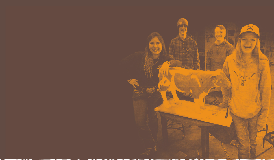


Photography: Social Media
Social media followers recognize the people first. We showcase the locals in our programs, the relationships that are formed, and the facilities that open the door to possibility.
Build Pagosa’s photography on social media features:
- Students in process of building
- Cohorts posing together
- The amicable relationship between training leaders and their students
- “Finished products” that students have built, whether as small as a woodworking item or as large as a facility
Social media should also feature new photos of the Regional Workforce Development Center. We are building buzz and anticipation. When the building is complete, we can celebrate how each room is used. Followers will get a real sense of what it’s like on the inside, and feel welcome to come see it for themselves.
For the best engagement, we keep text on images light and let the photos speak for themselves. Our grid works best as a scrapbook of the wonderful things we do, full of genuine moments and real stories, rather than a catalogue of advertisements. We save the details, context, and calls to action for the caption of the photos.
How to do color duotones
Instructions for duotones on Canva:
- Upload your photo – Click "Uploads" in the left sidebar and add your image, then drag it onto your canvas.
- Select the image – Click on the photo once to select it.
- Open the Edit Photo panel – Click "Edit Photo" in the top toolbar.
- Find Duotone – Scroll down to the "Effects" section and click "Duotone."
- Pick a preset – Choose any starting duotone preset (you'll customize the colors next).
- Customize the colors – Click on the two color swatches shown and enter your brand's exact hex codes — one for shadows (darker tone) and one for highlights (lighter tone).
- Adjust intensity – Use the slider (if available) to fine-tune how strong the effect looks.
- Apply and review – Click outside the panel to apply, then check contrast and readability if you're adding text over the image.
- Download or reuse – Export the image, or save it as a brand asset so you can apply the same duotone look consistently across future designs.
Duotone coloring helps:
- Simplify busy photography
- Accentuate low-resolution cell phone photos (where high-resolution photos are not possible)
- Make posters and display images feel more polished and intentional
- Create a darker or lighter value for text/the logo to appear more clearly on
06
Typography
Headings
Manrope is available on Google Fonts for free.
Headings establish visual hierarchy and guide readers through content, signaling what is most important and helping audiences quickly navigate pages, documents, and materials.
H1
Manrope Extrabold
Size: 32pt
110% Leading
0% Tracking
H2
Manrope Bold
Size: 24pt
110% Leading
0% Tracking
H3
Manrope Semibold
Size: 18pt
110% Leading
0% Tracking
H4
Manrope Semibold
Size: 14pt
120% Leading
0% Tracking
Body
Body text is the primary vehicle for communicating a foundation's message, making legibility essential — a well-chosen body font ensures that content is easy to read across all formats, sizes, and audiences.
Body - small can be used for captions, subsection labels, and secondary details.
Body - Primary
Manrope Regular
Size: 10pt
120% Leading
1% Tracking
Body - Small
Manrope Regular
Size:7pt
120% Leading
1% Tracking
About Us
Almost a decade ago, a group of local contractors began meeting to discuss the challenges they faced hiring skilled, local talent.
Out of these conversations, Build Pagosa was formed.
Mission
Build Pagosa’s Mission is to provide a skilled workforce for the Pagosa Springs community and surrounding area through public-private partnerships, financial support and workforce training.
Photos courtesy of Photographer 1.
Introduction
Build Pagosa is a 501(c)(3) nonprofit founded in 2017 by local contractors frustrated by a regional skilled-labor shortage.
What began as a woodworking class for 16 students has grown into a six-pathway Career & Technical Education operation serving Pagosa Springs High School — and a $6.5M capital campaign to build a 10,000 sq ft Regional Workforce Center that extends programming to adults and the wider five-county region.
Contents
Brand Strategy
01
Brand Personality
02
Logo
03
Color
04
Graphic Elements
05
Typography
06
01
Brand Strategy
Mission
Our mission is to provide a skilled workforce for the Pagosa Springs community and surrounding area through public-private partnerships, financial support, and workforce training.
Service Area
Our reach extends across five counties — Archuleta, Conejos, Hinsdale, and Mineral in Colorado, and Rio Arriba in New Mexico — covering one of the most rural and underserved workforce regions in the Southwest.
History
Almost a decade ago, a group of local contractors began meeting to discuss the challenges they faced hiring skilled, local talent. Out of these conversations, Build Pagosa was formed.
Working with the local school district, Build Pagosa helped start a woodworking and construction class which served sixteen students, all with completely donated materials. These classes - which began as a way to keep students engaged - grew to be much more.
Together with the Archuleta School District, Pagosa Springs Community Development Corporation, Pueblo Community College, and industry partners across the region, we connect people to trainings, internships, and hands-on opportunities that people need to build a career here, in Pagosa Springs.
Our Programs
Education Partnerships
We work with the high school to build and strengthen Career & Technical Education pathways - investing in teacher development, facilities, equipment, and supplies across six program areas.
Construction Bootcamp
A week-long intensive training - offered in partnership with Pueblo Community College and Pagosa Springs CDC - that gives participants the hands-on skills and industry connection needed to enter the construction workforce.
Industry Requested Trainings
Working directly with local employers, we offer trainings in credentials they need most - including broadband, CDL, and NCCER certifications - so workers gain qualifications tied to real, available jobs.
Dental School Tuition Assistance
In partnership with Pagosa Peak Dental, we provide tuition support for attendees of the southern Colorado Dental Assisting School - a local pathway into a higher-paying healthcare career without leaving the regon.
Student Internships
We partner with industry employers to reimburse summer internship wages - making it easier for local business to hire students and to gain real-world experience. Employer participation triples when reimbursement is available.
Student Internships
We partner with industry employers to reimburse summer internship wages - making it easier for local business to hire students and to gain real-world experience. Employer participation triples when reimbursement is available.
02
Brand Personality
Our Core Values
Collaboration
Innovation
Integrity
Opportunity
Personality
Our brand personality resembles the often-messy modality of human existence as a series of dynamic tensions that form a multifaceted tapestry. Our messaging has the ability to slide more toward one end of the spectrum or the other in any given area, while always keeping in mind the opposite end.
Community Rooted
Motivating
Honest about challenges
Relaxed
Tone of Voice
We speak like a neighbor

We speak like an expert
We tell stories

We cite data
We're steadied

We're urgent
We celebrate what's possible

We name what's broken
We focus on process

We focus on outcomes
Visual Identity
Organic and hand-crafted

Precise and engineered
Warm

Cool
Unbound

Structured
Textured

Clean
Quiet confidence

Clear authority
Our role in the community
We're a support system

We're a launchpad
We follow the community's lead

We set the direction
We're a local treasure

We're a national model
We're humble about what we've built

We're assertive on what we've built
We're one part of the solution

We are the solution
Our geography is a limitation

Our geography is a strength
The founding story is central

The founding story is context
03
Logo
Logo Lockups
A lockup is the intentional arrangement of a logo and its accompanying elements.
It is a fixed relationship that should not change. In this case, the lockup refers to the pairing of the symbol and name in full color treatment.
Primary
The primary logo (icon + wordmark together) works best where full brand identity and recognition matter most — think business card fronts, signage, apparel, and any first or standalone touchpoint with the brand.
Secondary
If the logo needs to be used alongside busier backgrounds, it can be reduced down to two brand colors.
This increases contrast and simplicity, while still maintaining the overall shape and feel of the logo.


Black and White
Black and white versions used for black and white publications only (i.e. monochromatic ads).


Alternate Marks
A simplified variation of the logo — used when the full primary logo won't fit or fit well. Works best in small or square spaces where detail would get lost, like favicons, app icons, social media profile photos, and watermarks.
Wordmark
Best used where space is tight, horizontal, or minimal: headers, email signatures, letterheads, apparel, and website nav bar.
Outlined Sticker
Best used for stickers and busy backgrounds.

Icons
The icon is the standalone graphic mark of the logo — used independently across applications where simplicity is key, such as profile pictures, favicons, embroidered patches, or anywhere the full lockup isn't practical.
Primary Icon
Works best where the brand is already well known or space is too small for text, like app icons, favicons, social media avatars, and pattern or texture elements.
Single-Color Icon
Works best on colored or busy backgrounds, in print with limited color options, on signage like embossing or engraving, and in watermarks where a flat, monochrome mark reads more cleanly.
Favicon
A favicon is the small icon (usually 16×16 or 32×32 pixels) that appears next to a website's title in a browser tab, bookmark list, or history entry. It's typically a simplified version of a brand's logo, used to help users quickly recognize a site among multiple open tabs.
Primary
Works best as a favicon when being displayed particularly small, like website favicons, or social media profiles.
Alternate
Works best when slightly more space is available and the wordmark remains legible, like larger social media avatars, or where the audience benefits from reading the name directly.
Clear Space
Logo clear space is the minimum area around a logo that keeps it legible and prominent.
Consistently applying this space across all materials preserves brand recognition.
A quick way to ensure enough clear space is to copy the icon and paste it around the edges of the logo.

Best Practices
- Do ensure there is adequate space around the logo from other extraneous elements.
- Do not resize or change the position of any individual element.
- Do not use any other font, no matter how close it resembles the font in our logo.
- Do not distort the logo. Any re-sizing must be done in proportion.
- Do not change the colors, even if they look similar. Use the official color specifications detailed in these guidelines.
- Do not use a drop shadow or outer glow on the logo. Use discretion on the appropriate colored logo to contrast with busy or colored backgrounds.


04
Color
Color Overview
The Build Pagosa color palette is derived directly from photography of the Pagosa region. It works to create a distinct visual language that is grounded in natural, earthy tones.
Primary Palette
A primary color palette is the foundation of a brand's visual identity — the core set of colors used most consistently across all touchpoints, including logos, signage, and key design elements. Establishes immediate recognition and sets the overall tone of the brand.
Bootcamp Brown
Hex: #5E4C43
Oxide
Hex: #BD6239
Chimney Rock
Hex: #D78F2D
Weminuche Green
Hex: #666643
Secondary Palette
The secondary color palette complements and supports the primary colors, providing flexibility and visual depth across a wider range of applications. These colors are used to add variety, create contrast, and enhance the overall design system without overpowering the brand's core identity.
Shop Floor Gray
Hex: #E0DBD1
Sawdust
Hex: #F4EED8
Steel
Hex: #CDD3D3
Sugarloaf
Hex: #FAF9F5
Type Colors
The following arrangements help distinguish the most legible typography color pairings.
Only Sugarloaf text on Oxide
Only Sugarloaf text on Chimney Rock
Only Sugarloaf text on Weminuche Green
Only Bootcamp Brown text on Shop Floor Gray
Only Bootcamp Brown text on Sawdust
Only Bootcamp Brown text on Steel
Only Bootcamp Brown text on Sugarloaf
Only Sugarloaf text on Bootcamp Brown
Color Parings
These color combinations are proven to work well together, providing enough of a value contrast to accent each other.
Color Pairings to Avoid
These color combinations do not work well together or connote other brand colors that we aim to avoid (i.e. orange and blue as Broncos colors).
Recommended Use Cases
Understanding how brand colors are used — and which combinations are most legible — ensures that every touchpoint is not only visually consistent but accessible and easy to read across all formats and audiences.
Bootcamp Brown
Recommended for:
- Logo
- Text color (primary)
- Web: Background color, buttons, hover effects
Not recommended for:
- Reports or text-heavy docs: Full-page background (use only in select boxes)
Oxide
Recommended for:
- Smaller visual accents
- Logo
- Web: Small sections of color
- Social Media: Background color for posts
Not recommended for:
- Text color
- Reports or text-heavy docs: Full-page background (use only in select boxes)
Chimney Rock
Recommended for:
- Smaller visual accents
- Web: Small sections of color
- Social Media: Background color for posts
Not recommended for:
- Logo
- Text color
- Reports or text-heavy docs: Full-page background (use only in select boxes)
Weminuche Green
Recommended for:
- Web: Background color, buttons, hover effects
- Social Media: Background color for posts
Not recommended for:
- Logo
- Text color
- Reports or text-heavy docs: Full-page background (use only in select boxes)
Shop Floor Gray
Recommended for:
- Web: Background color, buttons, hover effects
- Social Media: Background color for posts
- Reports or text-heavy docs: Full-page background
Not recommended for:
- Logo
- Text color
- Reports or text-heavy docs: Full-page background (use only in select boxes)
Sawdust
Recommended for:
- Text color (on darker backgrounds)
- Web: Background color, buttons, hover effects
- Social Media: Background color for posts
- Reports or text-heavy docs: Full-page background
Not recommended for:
- Logo
- Smaller visual accents
Steel
Recommended for:
- Web: Background color, buttons, hover effects
- Social Media: Background color for posts
- Reports or text-heavy docs: Full-page background
Not recommended for:
- Logo
- Text color
- Reports or text-heavy docs: Full-page background (use only in select boxes)
Sugarloaf
Recommended for:
- Logo
- Text color (on darker backgrounds)
- Web: Background color, buttons, hover effects
- Reports or text-heavy docs: Full-page background
Not recommended for:
- Smaller visual accents
05
Graphic Elements
Image Textures
We utilize textured image backgrounds in Adobe Photoshop, Figma and Canva to bring depth and a handcrafted quality to the brand.
Earthy and woody textures are specifically used to bring a connection to the natural world and the Colorado region, as well as referencing the materials used in the construction courses.
It is important to always use high-resolution textures. We frequently refer to Unsplash.com or Pixabay.com to get free-to-low-cost textures.
Textured Shapes
We’ve created a suite of textured shapes that feature rough edges inspired by real, hand crafted woodwork. The shapes should be used as accents, like as background elements, line breaks, or image cutouts.
Its important not to resize or modify these shape graphics as to avoid stretching or amplifying the texture.

Symbols
We use symbols to add visual flair across the brand and to allow users to quickly categorize information based on pictorial marks. They work best when supporting text or as small accents.
Our icon set is tailored for Build Pagosa, extending the rough wood cut look found in the logo and textured shapes. Because of this, no other icons should be used.


Program and CTE Symbols
It’s important to ensure that symbols are kept consistent so that people can quickly and easily identify what each symbol represents
Education partnerships:
Backpack
Construction bootcamp:
Hard Hat
Industry requested trainings:
Clipboard
Dental school tuition assistance:
Tooth
Student internships:
Student
Hospitality & culinary
Chef
Building trades
Wrench
Agriculture & resources
Tractor
Computer science
Code
Transportation & automotive
Car
Health services
Heart
Social Media Templates for each Audience
- Youth and Young Adults (under 18)
We use short, fast-paced video content led by students and interns themselves.
Recommended channels: Instagram, TikTok, YouTube
REAL TESTIMONIALS FROM STUDENTS
We hand the camera to our interns and students to hear about direct impact. No scripts, just authentic relating.
“DAY-IN-THE-LIFE” CLIPS
Students show clips from the shop floor, the job sites, and the classroom.
15
DAYS
Until Submissions are Due
INFORMATIONAL / COUNTDOWNS
We help students understand upcoming important dates, must-do’s for their applications, and helpful tips for getting the most of their certification.
Jim just got his NCCER certificate. Here’s what happens next.
MILESTONE CELEBRATIONS
Students share about their accomplishments. I.e. their first solo build, their first paycheck, first certification.
- Adults in the CTE programs (over 18)
We lead with placement data, program timelines, and clear calls to action. Can be static or video (with preference to video)
Recommended channels: Instagram, YouTube, Facebook, LinkedIn, advertisements.
ADULTS IN CURRENT PROGRAMS
Here’s where we go in the classrooms and on the job sites, and showcase what adults are learning. We are documenting their journey.
ALUMNI NETWORKING
We post short testimonial videos from recent graduates who have new credentials and are ready for/participating in the workforce.
250+
JOBS
go unfilled in our region every year. Not because the work isn't there, but because the training infrastructure isn't.
DIRECT IMPACT NUMBERS
We share our numbers plainly: placement rates, time-to-credential, earning potential. We incentivize adult enrollment.
10
DAYS
Until our Regional Workforce Development Center opens!
INFORMATIONAL / COUNTDOWNS
We help adults understand upcoming important dates, must-do’s for their applications, and helpful tips for getting the most of their certification.
- Training Professionals, Trade Employers & Contractors
Professional channels communicate curriculum quality and graduate readiness.
Recommended channels: Facebook, LinkedIn, job posting boards, advertisements.
We’re seeking training professionals for our
CDL Program
ROLES AVAILABLE
We post curriculum updates, certifications offered, and graduate competencies.
REAL TESTIMONIALS
We publish short employer testimonial videos explaining why they hire our graduates.
Win-win:
A training program for them. A new group of skilled workers for your business.
LABOR MATCHMAKING
We include workforce data and labor market context to ensure training professionals understand the value they’ll get out of leading at Build Pagosa.
Thank you to Pagosa Peak Dental for supporting the Fall 2026 cohort!
CHARITABLE LANGUAGE
Training professionals are giving back. We actively show recognition and gratitude for the time they give to the community.
Photography: Special Styles
Our website homepage hero images feature a branded duotone, jagged edges reflective of our logo, and earthy texture overlays. We create a consistent, professional first impression across each page of the website.
This stylistic treatment is reserved for the website and formal materials. This helps establish brand recognition in a controlled, polished environment. Users of the website are more likely to trust branded, professional photography.
Social media operates differently. Platforms like Instagram, Facebook, and TikTok reward authentic, natural content without filters. Viewers on social media will trust in-the-moment photography.
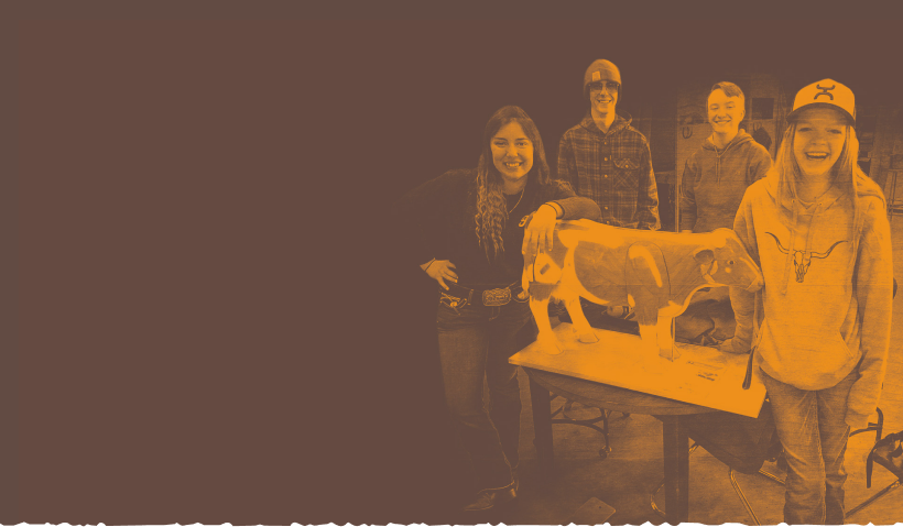


Photography: Social Media
Social media followers recognize the people first. We showcase the locals in our programs, the relationships that are formed, and the facilities that open the door to possibility.
Build Pagosa’s photography on social media features:
- Students in process of building
- Cohorts posing together
- The amicable relationship between training leaders and their students
- “Finished products” that students have built, whether as small as a woodworking item or as large as a facility
Social media should also feature new photos of the Regional Workforce Development Center. We are building buzz and anticipation. When the building is complete, we can celebrate how each room is used. Followers will get a real sense of what it’s like on the inside, and feel welcome to come see it for themselves.
For the best engagement, we keep text on images light and let the photos speak for themselves. Our grid works best as a scrapbook of the wonderful things we do, full of genuine moments and real stories, rather than a catalogue of advertisements. We save the details, context, and calls to action for the caption of the photos.
How to do color duotones
Instructions for duotones on Canva:
- Upload your photo – Click "Uploads" in the left sidebar and add your image, then drag it onto your canvas.
- Select the image – Click on the photo once to select it.
- Open the Edit Photo panel – Click "Edit Photo" in the top toolbar.
- Find Duotone – Scroll down to the "Effects" section and click "Duotone."
- Pick a preset – Choose any starting duotone preset (you'll customize the colors next).
- Customize the colors – Click on the two color swatches shown and enter your brand's exact hex codes — one for shadows (darker tone) and one for highlights (lighter tone).
- Adjust intensity – Use the slider (if available) to fine-tune how strong the effect looks.
- Apply and review – Click outside the panel to apply, then check contrast and readability if you're adding text over the image.
- Download or reuse – Export the image, or save it as a brand asset so you can apply the same duotone look consistently across future designs.
Duotone coloring helps:
- Simplify busy photography
- Accentuate low-resolution cell phone photos (where high-resolution photos are not possible)
- Make posters and display images feel more polished and intentional
- Create a darker or lighter value for text/the logo to appear more clearly on
06
Typography
Headings
Manrope is available on Google Fonts for free.
Headings establish visual hierarchy and guide readers through content, signaling what is most important and helping audiences quickly navigate pages, documents, and materials.
H1
Manrope Extrabold
Size: 32pt
110% Leading
0% Tracking
H2
Manrope Bold
Size: 24pt
110% Leading
0% Tracking
H3
Manrope Semibold
Size: 18pt
110% Leading
0% Tracking
H4
Manrope Semibold
Size: 14pt
120% Leading
0% Tracking
Body
Body text is the primary vehicle for communicating a foundation's message, making legibility essential — a well-chosen body font ensures that content is easy to read across all formats, sizes, and audiences.
Body - small can be used for captions, subsection labels, and secondary details.
Body - Primary
Manrope Regular
Size: 10pt
120% Leading
1% Tracking
Body - Small
Manrope Regular
Size:7pt
120% Leading
1% Tracking
About Us
Almost a decade ago, a group of local contractors began meeting to discuss the challenges they faced hiring skilled, local talent.
Out of these conversations, Build Pagosa was formed.
Mission
Build Pagosa’s Mission is to provide a skilled workforce for the Pagosa Springs community and surrounding area through public-private partnerships, financial support and workforce training.
Photos courtesy of Photographer 1.